Hong Kong, Italian Style
2017
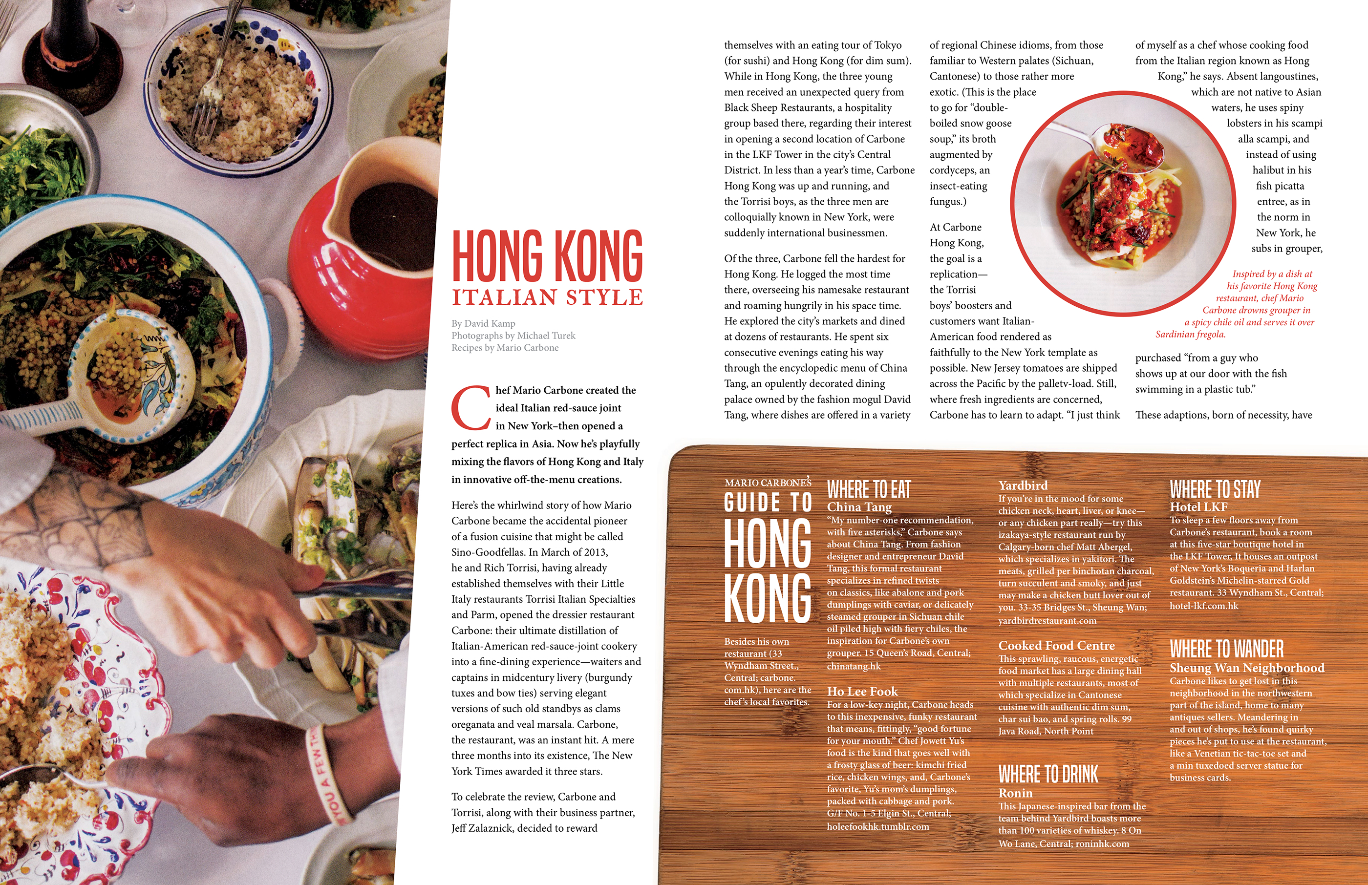
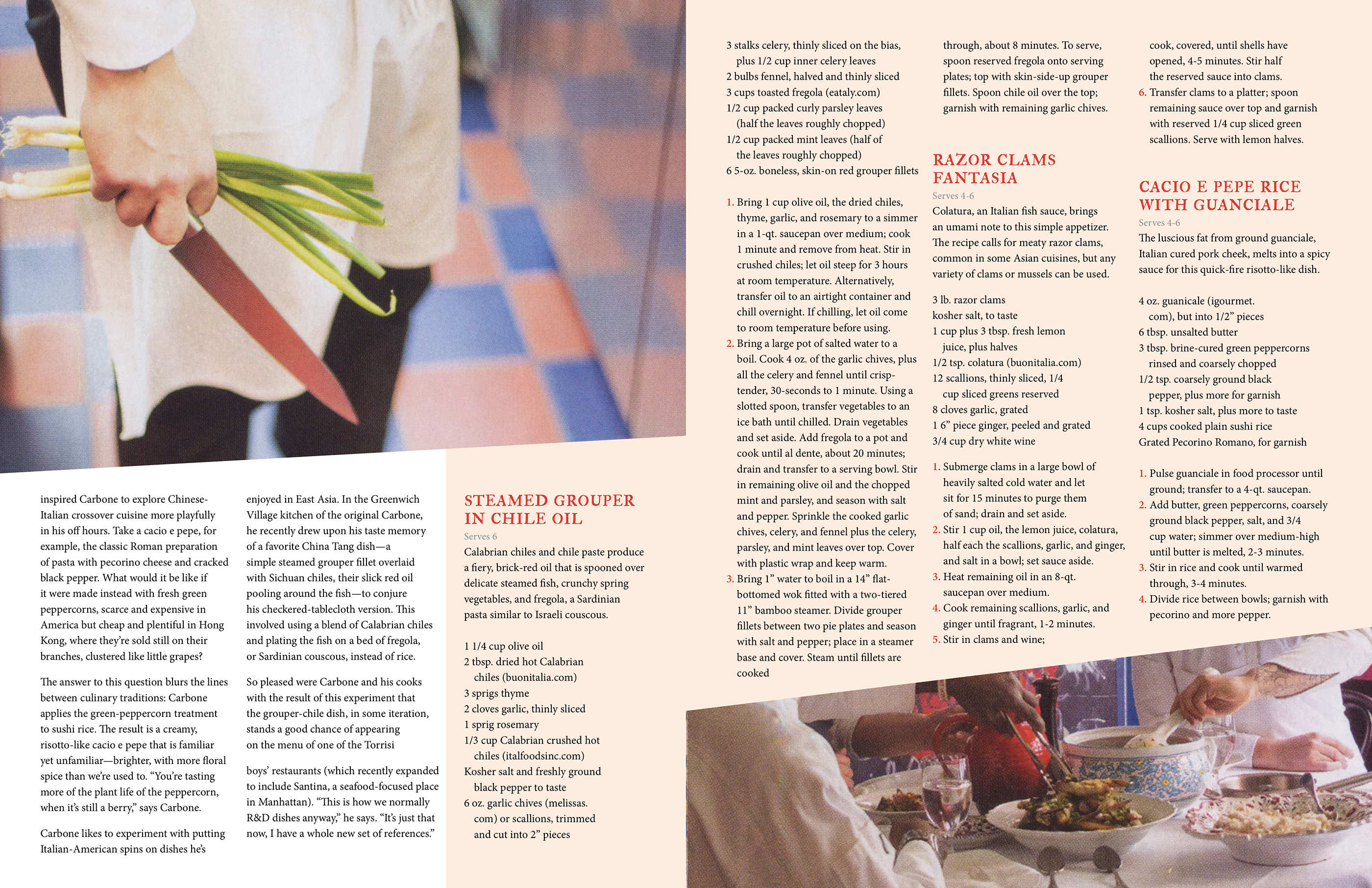
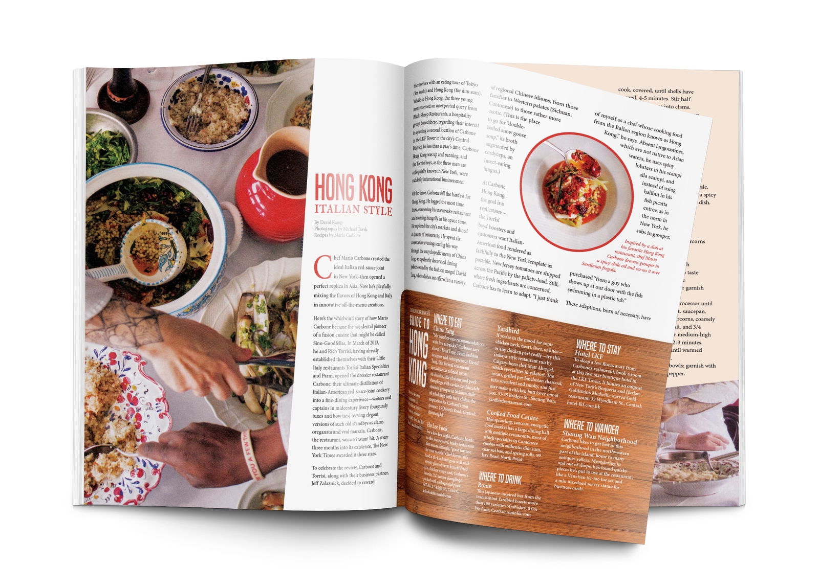
This piece was an exercise in laying out multiple spreads for an editorial. I wanted to strike a pleasant balance between pages of full, rich copy and beautiful imagery to compliment it. The color red was chosen as a key color because of its connections to hunger and the warm, pleasant feeling of eating delicious food with friends or loved ones. Graphic elements connected to food were included in the piece, such as a cutting board which serves as a backdrop for copy. Strong diagonal lines draw the reader’s eye across the page, and lead them to scan the article.


